Mobile Advertising Strategy: Reaching Customers on Any Device
Master mobile advertising to capture 70%+ of your potential customers. Learn mobile-first creative, targeting strategies, and optimization techniques that drive conversions on smartphones and tablets.
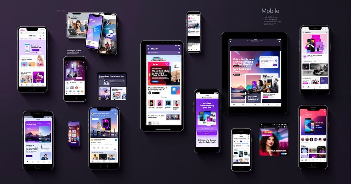
Mobile Advertising Strategy: Reaching Customers on Any Device
Mobile devices account for 60-75% of all paid advertising traffic, yet many businesses still treat mobile as an afterthought. This is a massive missed opportunity. Users searching on mobile have higher purchase intent, especially for local services, and convert immediately when the experience is optimized.
At Silver Spider Media, mobile-optimized campaigns consistently outperform desktop-focused campaigns by 40-60%. In this comprehensive guide, we'll show you how to create a mobile-first advertising strategy that captures this dominant traffic source.
See What Your Site Will Cost
Build your personalised quote in under 2 minutes. No obligation.
The Mobile Reality
Mobile Dominance in Numbers
UK Mobile Statistics (2026):
- 71% of all internet traffic is mobile
- 63% of Google searches happen on mobile
- 76% of people who search for something nearby visit a business within 24 hours
- 28% of mobile searches result in a purchase within 24 hours
- 51% of smartphone users have discovered a new product/service through mobile search
For Local Businesses: Mobile traffic is even higher:
- 80%+ of "near me" searches are mobile
- 88% of local searches on mobile result in call or visit within 24 hours
- 72% of consumers visiting a local business did so within 5 miles
The Opportunity: Mobile users are high-intent, ready-to-buy customers searching at the moment of need. Capturing them requires mobile-optimized everything, ads, landing pages, user experience.
Why Mobile Advertising is Different
Screen Size: Mobile screens are 4-6 inches, everything must be larger, simpler, and more direct than desktop.
Attention Span: Mobile users are distracted, multitasking, and impatient, you have 3-5 seconds to grab attention and convey value.
Context: Mobile users are often on-the-go, searching while walking, driving (passenger), shopping, or waiting, requiring immediate, actionable information.
Input Method: Typing on mobile is frustrating, minimize required text input, maximize click-to-call and one-tap actions.
Connection Speed: Mobile connections can be slower, pages must load under 3 seconds or users bounce.
When we optimized Bourne Accounting's campaigns for mobile, simplified forms, prominent call buttons, 2-second load times, their mobile conversion rate jumped from 2.3% to 13.7%, making mobile their highest-performing traffic source.
Mobile-First Ad Creative
Google Search Ads for Mobile
Headline Strategy:
Mobile truncates headlines faster than desktop, prioritize information:
Headline 1 (Most Important): Front-load service + location "Emergency Plumber Belfast" (24 characters)
Headline 2: Key benefit or USP "24/7 | No Call-Out Fees" (24 characters)
Headline 3: CTA or social proof "Call Now | 4.9★ Rated" (22 characters)
Why This Works: On small screens, only Headline 1 and part of Headline 2 may show, critical information comes first.
Description Strategy:
Description 1: Immediate value + urgency "Fast response across Belfast. All work guaranteed. Family-run since 1998. Call 24/7." (89 characters)
Description 2: CTA + trust signals "500+ happy customers. Transparent pricing. Book online or call now, we answer 24/7." (90 characters)
Mobile-Specific Extensions:
Call Extensions (Critical):
- Click-to-call button appears prominently
- Track calls as conversions
- Schedule calls to business hours (or 24/7 if applicable)
Location Extensions:
- Show distance from user
- "Get Directions" button
- Linked to Google Business Profile
Callout Extensions (Short):
- "24/7 Service"
- "No Hidden Fees"
- "Same-Day Available"
Keep callouts short, they truncate quickly on mobile.
Facebook/Instagram Mobile Ads
Image/Video Specifications:
Square Format (1:1):
- Takes up most mobile screen
- Works in both Feed and Stories
- Recommended: 1080x1080px
Vertical Format (4:5):
- Takes up even more screen space
- Performs best in mobile Feed
- Recommended: 1080x1350px
Stories/Reels Format (9:16):
- Full-screen experience
- Highly immersive
- Recommended: 1080x1920px
Design Principles:
Large, Bold Text: Must be readable on small screens, minimum 40-50px font size in images.
Minimal Text: Facebook recommends under 20% of image as text, follow this for best performance.
Clear Focal Point: One primary subject, don't clutter with multiple elements.
Thumb-Stopping: Bright colors, movement, faces, and contrast grab attention in scrolling feeds.
Copy Strategy:
Primary Text (First 125 Characters): Hook before "See More" truncation "Transform your garden this summer 🏡 Belfast's top-rated landscaper creates stunning outdoor spaces from £3,500..."
Why This Works: Hook grabs attention, emoji adds visual interest, price and location qualify audience, all before "See More."
Video Strategy:
Length: 15-30 seconds maximum, attention spans are short.
First 3 Seconds: Hook immediately, most people scroll past in 3 seconds.
Captions: 85% watch without sound, captions are essential.
Vertical Format: Optimized for how people hold phones naturally.
Eden Gardens NI tested square vs. vertical video ads:
- Square (1:1): 3.2% engagement rate, £21 CPL
- Vertical (4:5): 5.8% engagement rate, £14 CPL
Vertical format won dramatically by taking up more screen real estate.
Mobile Landing Page Optimization
Speed is Critical
Load Time Standards:
- Under 2 seconds: Excellent
- 2-3 seconds: Acceptable
- 3-5 seconds: Poor (bounce rate increases dramatically)
- Over 5 seconds: Terrible (70%+ bounce rate)
How to Improve Speed:
Image Optimization:
- Compress images (use WebP format)
- Lazy loading for below-fold images
- Serve appropriate sizes for mobile
Minimize Code:
- Remove unnecessary CSS/JavaScript
- Minify code
- Use caching
Hosting:
- Use CDN (Content Delivery Network)
- Choose fast hosting provider
Testing: Google PageSpeed Insights shows mobile load time, aim for 90+ score.
Mobile-First Design
Layout:
Single Column: Everything stacks vertically, no multi-column layouts.
Large Tap Targets: Buttons minimum 44x44 pixels, fingers are bigger than mouse pointers.
Readable Text: Minimum 16px font size, no squinting required.
Ample White Space: Don't cram content, scrolling is expected and acceptable.
Simplified Navigation: Remove top navigation, you want one action (convert), not exploration.
Form Optimization
Forms are where most mobile conversions die. Optimize aggressively:
Minimize Fields:
Too Many (8 fields):
- First Name
- Last Name
- Phone
- Address
- City
- Postcode
- Message
Optimized (4 fields):
- Full Name
- Phone
- Brief Message (optional)
Every additional field reduces conversion rate 5-10%.
Smart Field Features:
Auto-Complete: Enable browser auto-fill, massively reduces friction.
Appropriate Keyboards:
- Email field triggers email keyboard (@, .com)
- Phone field triggers number pad
- Postcode field triggers alphanumeric
Inline Validation: Show errors immediately, not after submission, reduces frustration.
Large Input Fields: Minimum 44px height, easy to tap.
Clear Labels: Above or inside field, always visible.
Right Choice Roofing Specialist reduced their mobile form from 8 fields to 3 (Name, Phone, Service Needed). Conversion rate increased from 4.1% to 17.3%, 4.2x improvement.
Click-to-Call Prominence
For service businesses, phone calls are 40-60% of conversions.
Best Practices:
Sticky Call Button: Floating button that stays on screen as user scrolls.
Above the Fold: Primary call button visible without scrolling.
Large and Obvious: Full-width button, contrasting color, clear text: "Call Now" or "Tap to Call."
Track Calls: Use call tracking to measure phone conversions.
Example Layout:
Hero Section:
- Hero Image
- Headline: Emergency Plumber Belfast
- Subhead: 24/7 Service | 1-Hour Response
- ★★★★★ 4.9 from 500+ Reviews
Primary CTA:
- CALL NOW BUTTON - Full Width, Bright Color
Alternative:
- REQUEST QUOTE BUTTON - Secondary Style
Supporting Content:
- 3 Bullet Points of Key Benefits
- Testimonial Quote
- Trust Badges (Years, Certifications)
- Gallery of Work (3 Images)
Footer:
- STICKY CALL BUTTON - Always Visible
Visual Hierarchy
Most Important (Top of Page):
- Headline matching ad promise
- Primary CTA (Call or Form)
- Trust signals (rating, reviews)
Secondary (Middle):
- Key benefits (3-5 bullets)
- Social proof (testimonials)
- Visual proof (images of work)
Tertiary (Bottom):
- Additional information
- FAQs
- Secondary CTA
Don't bury your call button below three paragraphs of text, most users won't scroll that far.
Platform-Specific Mobile Strategies
Google Ads Mobile Strategy
Campaign-Level Adjustments:
Mobile Bid Adjustments: If mobile converts better, increase mobile bids by 20-50%.
Example:
- Desktop: £2.00 base bid
- Mobile: +30% adjustment = £2.60 bid
Location-Based Mobile Targeting:
Radius Targeting with Mobile Focus:
- Mobile users are more likely local
- Use smaller radius for mobile (higher intent)
- Bid higher for closer proximity
Call-Only Campaigns:
Create campaigns that only show on mobile with click-to-call ads (no landing page).
Best For:
- Emergency services
- Appointment-based businesses
- High-value phone consultations
Format: Headline → Description → CALL button
Perfect for capturing users needing immediate help.
Facebook/Instagram Mobile Strategy
Placement Optimization:
Mobile-First Placements:
- Instagram Feed (mobile-only)
- Instagram Stories (mobile-only)
- Facebook Stories (mobile-only)
- Facebook Feed (mobile-dominant)
Pause Poor Mobile Placements:
- Right Column (desktop only, poor performance)
- Audience Network (often low quality)
Mobile-Specific Audiences:
Target Mobile Users Specifically: Create audiences based on mobile behavior:
- "Mobile app users"
- "Users who primarily access on mobile"
- Mobile-specific interests
Creative Strategy:
Test Mobile-Specific Formats:
- Stories ads (full-screen, immersive)
- Reels ads (trending format)
- Collection ads (shopping focused)
Eden Gardens NI shifted 80% of budget to mobile-first placements (Instagram Feed, Stories) vs. desktop placements:
- Mobile CPL: £14
- Desktop CPL: £37
- Mobile conversion rate: 8.9%
- Desktop conversion rate: 3.2%
Mobile dramatically outperformed.
LinkedIn Mobile Strategy
Mobile Context:
LinkedIn mobile users are often browsing during commutes or breaks, capture attention quickly.
Creative Adjustments:
Shorter Copy: Mobile users won't read long-form content, get to the point in first 2 lines.
Strong Visuals: Data graphics, bold headlines, professional photography stand out in feed.
Lead Gen Forms:
LinkedIn's native lead gen forms are mobile-optimized, pre-filled with profile data, no typing required.
Much higher conversion rates than sending to external landing pages on mobile.
See What Your Site Will Cost
Build your personalised quote in under 2 minutes. No obligation.
Mobile User Behavior Insights
Near Me Searches
"Near Me" Search Growth: Up 150% in last 2 years, mobile users expect local results.
Optimization:
Google Business Profile: Essential for appearing in "near me" results.
Location Pages: Create dedicated pages for each service area.
Local Keywords:
- [service] near me
- [service] [neighbourhood]
- [service] in [city]
Ad Extensions: Location extensions show distance and directions.
Voice Search Optimization
Voice Search Stats:
- 27% of UK population uses voice search on mobile
- Voice searches are conversational and question-based
Optimization:
Natural Language Keywords:
- "where can I find a plumber near me"
- "what's the best accountant in Belfast"
- "how much does landscaping cost"
FAQ Schema: Structure content to answer common questions.
Conversational Ad Copy: Match how people speak, not just type.
Mobile Shopping Behavior
Research on Mobile, Buy on Desktop (Sometimes):
Some users research on mobile but convert on desktop later, don't judge mobile solely on last-click attribution.
Cross-Device Tracking:
Enable Google's cross-device conversion tracking to see full customer journey.
Many "mobile assists" don't get credit in last-click attribution but are valuable.
Mobile Measurement and Analytics
Essential Mobile Metrics
Device Performance:
Track Separately:
- Mobile conversion rate
- Tablet conversion rate
- Desktop conversion rate
Mobile-Specific KPIs:
Call Conversions: Critical for mobile, many users call vs. form fill.
Click-to-Call Rate: How many clicked phone number vs. total clicks.
Bounce Rate by Device: High mobile bounce = poor mobile experience.
Mobile vs. Desktop ROI:
Calculate separately:
- Mobile ROAS
- Desktop ROAS
- Tablet ROAS
Often mobile delivers better ROI despite lower average order value due to higher conversion rates and lower CPCs.
Google Analytics Mobile Reports
Location: Audience → Mobile → Overview
Key Data:
- Traffic by device type
- Bounce rate by device
- Conversion rate by device
- Average session duration by device
Actions:
If mobile bounce rate is 60%+ (20%+ higher than desktop), your mobile experience needs immediate improvement.
If mobile conversion rate is significantly lower than desktop, optimize:
- Page speed
- Form simplification
- Call buttons
A/B Testing Mobile-Specific
Test Mobile vs. Desktop Separately:
Winning desktop variation may not win on mobile, test both.
Mobile-Specific Tests:
Button Size: Test different CTA button sizes (full width vs. 80% width vs. centered).
Form Length: Test 3 fields vs. 5 fields vs. 7 fields.
Click-to-Call Position: Test header vs. hero section vs. sticky footer.
Image vs. Video: Test which performs better on mobile.
Premium CNC Cut & Design tested mobile form length:
- 7 fields: 3.1% conversion rate
- 5 fields: 6.8% conversion rate
- 3 fields: 11.2% conversion rate
Simplification tripled conversion rate.
Advanced Mobile Strategies
Progressive Web Apps (PWAs)
What They Are: Websites that function like mobile apps, fast, app-like experience without app download.
Benefits:
- Faster load times
- Offline functionality
- Add to home screen
- Push notifications
When to Consider: High mobile traffic (70%+), repeat visitors, e-commerce.
AMP (Accelerated Mobile Pages)
What It Is: Google's framework for ultra-fast mobile pages.
Benefits:
- Lightning-fast load times (0.5-1 second)
- Priority in Google search results
- Lower bounce rates
Downsides:
- Limited design flexibility
- Some functionality restrictions
Best For: Content-heavy sites (blogs, news), lead generation pages.
Mobile-First Indexing
Google's Standard: Google now uses mobile version of your site for ranking, desktop is secondary.
Implications:
If mobile site is inferior to desktop, your rankings suffer.
Optimization:
Ensure mobile and desktop have:
- Same content
- Same structured data
- Same meta tags
- Same internal linking
Common Mobile Advertising Mistakes
1. Desktop-First Mindset
Problem: Designing for desktop, treating mobile as afterthought Fix: Design for mobile first, adapt to desktop
2. Slow Load Times
Problem: 5-8 second mobile load times killing conversions Fix: Optimize to under 3 seconds, ideally under 2
3. Tiny Buttons and Text
Problem: Buttons and text designed for mouse pointers, not fingers Fix: Minimum 44x44px buttons, 16px text
4. Complex Forms
Problem: 10-field forms on mobile = 80%+ abandon rate Fix: 3-5 fields maximum, use auto-fill
5. No Click-to-Call
Problem: Forcing mobile users to navigate to contact page and manually dial Fix: Prominent click-to-call buttons throughout
6. Ignoring Mobile Data
Problem: Not analyzing mobile performance separately Fix: Track and optimize mobile campaigns independently
Get Professional Help
Mobile optimization requires expertise in mobile UX, platform nuances, testing methodology, and continuous refinement. Professional mobile campaign management typically delivers 2-4x better mobile conversion rates.
At Silver Spider Media, we specialize in mobile-first campaign strategies. Our clients see mobile conversion rates 2-3x higher than industry averages through optimized creative, landing pages, and user experiences.
Our services include:
- Mobile-first campaign strategy
- Mobile-optimized landing page design
- Cross-device tracking implementation
- Mobile-specific creative development
- Continuous mobile UX testing and optimization
Explore our paid advertising services or request a mobile strategy consultation.
Struggling with low mobile conversion rates? Request a free mobile experience audit and we'll identify exactly what's hurting your mobile performance.
Ready to Transform Your Business?
Join hundreds of successful businesses across the UK & Ireland who trust Silver Spider Media for their digital presence. Get your personalised quote today.
Our Web Design Services
Discover how we can help transform your online presence with our comprehensive digital solutions:
See These Strategies in Action
Check out how we've implemented these web design principles for real businesses:
Real results from our portfolio
Real results from our portfolio
Real results from our portfolio
Real results from our portfolio
Ready to Transform Your Online Presence?
Get a free, personalised quote in just 5 minutes. See exactly what your website will cost, no obligation, no surprises.